Blog readability is a topic that most bloggers don’t know about or don’t pay attention to but readability score of a blog matters a lot when it comes to user engagement or in the eyes of search engines. Most of us think that keeping good grammar and sentence structure is enough but that isn’t all, in fact, there is so much more to it.
Thus, it’s very important to improve readability of the blog as a whole. In this article, I am providing you with the complete Blog readability checklist which will make sure that your blog stands out in the crowd. This checklist contains a few things like most readable font, most legible font, best fonts for blogs and much more.
Before making changes to your blog, check the current readability score of your blog through this Readability test tool.
[toc]

Blog Design & Readability
Our environment and surroundings play a very vital role in our actions, same applies to the blog readability except that we can control each and every element of the blog from theme to the text font and can customize it as per our requirements to improve readability of text and to attract the user and increase his/her engagement on our posts.
A user scans the article first and then decides whether it’s worth a read or not. After first scan a user should be able to:
-
Grasp the main concept of blog post
-
Should understand the layout and structure of post
-
Tempted enough to read the whole content
-
Forced to share the content across social media
Other than that these few below mentioned factors must be used also:
Content shouldn’t be boring and Unorganized: Make it Eye-catching
When you read something, you often after reading highlight the important points in it so that you don’t have to read the unnecessary text over and over again and saves you the hassle, right?
Then do the same for your readers also, instead of writing the content in a whole one piece of article, make it into points, use headings and subheadings wherever appropriate, use bullet points, also images they are very helpful in conveying a message what words can’t. For e.g.:
Paragraph v/s Paragraphs
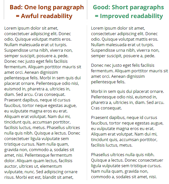
Which one will you read until the end?
List/Bullet points
Use of bulleted points instead of these short paragraphs is also useful when we have to give particular instructions or things like that. They can be used very cleverly to keep the reader hooked on till the end.

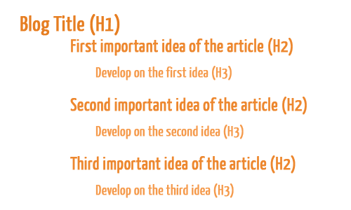
Headings and subheadings
They play a very important role in organizing the content and in helping the reader browse through content more effectively thus increasing the blog readability all over.

This is the hierarchy that is followed while using headings and subheadings to develop the idea and provide the reader a way to get to the most important content.
Typographical Emphasis
This includes the use of bold, italic; underline etc tags throughout the article to lay emphasis on most important words in the content. they can be very effectively used to convey the concept of the article in the first scan itself.

Fonts
When it comes to fonts, they have the power to distract or engage the readers easily as they alone make much effect improving readability of text. An attracting and interesting font can engage the audience on the other side an ugly or inappropriate one can push them away.
Most readable font
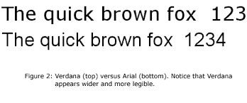
Few of the most use fonts to improve readability are Verdana, Arial and other sans serif fonts. Sans Serif fonts in small sizes are easier to read on the screen. Verdana is the best existing web font. Arial is good for the purpose of putting much info into a small space.
Most legible fonts
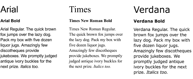
Legibility of font is also important for blog design and thus readability. The most legible fonts are Arial, Courier, and Verdana. At 10-point size, people prefer Verdana. Times New Roman is the least preferred. At 12-point size, Arial is preferred and Times New Roman is the least preferred.
Best fonts for blogs
There is no saying to the fact that every writer has it’s different needs and every reader prefers a different font but these fonts analyzed and surveyed gives you exactly what you are looking for. Let us know what you think about our selected best fonts for blogs.
See this Infographic too.
Design Elements that make you stand out
Designing when done properly beats every other thing as it alone enhances the environment of the post and makes reading a pleasure. We will be here telling you the key design elements that you can use to lure readers and keep them hooked.
Draw them in with a drop cap
A drop cap is basically a large capital letter at the very beginning of a text block that usually has the depth of two or even more lines of regular text.
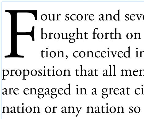
You can create a drop cap by:
Put this code in your theme’s style.css (or your theme’s equivalent):
“.drop_cap {color:#888; float:left; font-family:Georgia; font-size:3em; font-style:normal; text-shadow:#333 1px 1px;}
Adjust the CSS to fit the colours of your theme. That’s just a good starting point.
Wrap the first letter of your posts in:
“<span class=“drop_cap”>D</span>ropcap.
Big Intro text makes them curious
After luring them in with the drop cap you can make your intro engaging and give it a professional touch.
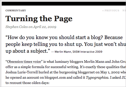
Try to start your article with an intro that tells everything that your article contains. Let the users know the stuff they are going to read.
If you manage to convince them with your first para you can easily have them stick to your post until the end.
Choose your Font wisely and carefully
Although we have covered the emphasis on fonts previously still we will list a few preferred fonts here used widely and by some of the top websites. You can even go creative and take a chance with a few of these designer fonts.
You can be creative or choose what these sites use. Personally, Arial is my usual go through font.
-
Google: Arial
-
Wikipedia: Sans-Serif
-
CNN: Arial
-
Yahoo: Arial (home), Georgia (content)
-
MSN: Arial
-
New York Times: Georgia
-
Wall Street Journal: Arial
Use the Golden Ratio for Line Height
After you have chosen the font you want to use, next thing you want to confirm is the line height which we recommend you do on the basis of Golden ratio rule. For that purpose, you can use a nifty tool created by Chris here.
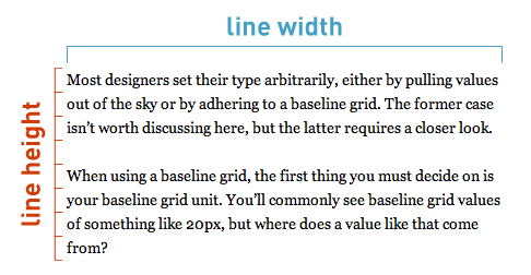
So make sure you have a good line height!!
Background
As you scroll down the posts, the background color becomes more predominant. So it’s very important that you choose a soothing color so that readers will respond positively to your message.
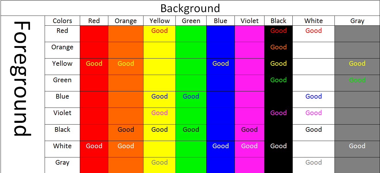
Most themes have built-in functionality to change and control the background color. If not, you can easily edit CSS of your theme accordingly.
Having a White Background is perfect for regular blog posts, but if you are making some sort of landing page for a product or software you may have to make it more attractive by using a dark background and a light text color.
You can further optimize your content by learning somewhat advanced tricks and tips given herein this article.
If you have anything else that we should add then please let us know in comments and also do let us know how this post helped you and any changes if you noticed after applying the knowledge you learned in it.


41 Responses
To engage with the readers interest the blog should be simple and precise so that the reader should not get confused. Lots of information shared in the blog post nice blog post keep the good work going.
Sir always I’m facing this issue again and again. I am using Yoast SEO but I don’t have premium version so I’m facing SEO and Readability issue.
This post will help me very much. I will follow these tips sir.
thank you.
Hey Manish,
Fantastic post!! The article covers almost all the important points that should be taken care while writing a good and interesting blog.
The point related to background-color is a good one to make regular blog post looks attractive to readers and gain their attention to the content.
Also, the title tags color must be changed according to the blog content if one doesn’t want to fill whole background color in its article.
Thumbs up! Hugely informative blog. Got some helpful pointers which I will apply in real-life situations. Thanks a lot for uploading this one.
dear admin Thanks for sharing such an informative post. People usually don’t care about these facts ..
Since I am new to blogging I have been spending time to read and improve. Thanks for helping me with the post.
Great post, very helpful information…
Thanks a lot for this guide on how to improve blog readability. I just updated my own blog with the ideas i just got from this content right away. I really appreciate
Awesome Post Manish Agrawal. You are absolutely right. Good readability is something which should be taken care of for many reasons but most of all to increase site dwell time.
I also publish a blog post on NeilHosting about it too.Maybe check it out
Hello,
This is nice post for how to improve blog post readability and having right to see you here and thanks a lot for sharing with us .
Hi Manish Agrawal,
Good article to understand what exactly Blog Post Readability. Bloggers those are not well much aware of Blog Post Readability.
They should visit on this post to understand value of Blog Post Readability.
thank you Manish Agrawal sir..its very use full article
Hi Manish, First I would like to thank you for sharing this and it was a good read. I am still new in digital marketing and still learning. Your blog is very helpful and I guess I’m going to follow you from now on.
Yes! Most of the bloggers are not focus on readability. It’s one of the ranking factor on Google.
The article was well informed .very articulate.
Nice………..
Hii,
good content
awesome article
Thanks for sharing valuable information
Thanks for sharing such an informative post. People usually don’t care about these facts but it matters. This is my first time on your post and find much more. Thanks again.
Something worth reading and something that made my day. Thanks for this article and I am going to use this strategy on my upcoming Amazon Affiliate Marketing blog. I hope it will give me viewers a great experience.
I have been wondering how i will put the drop cap on my articles . with this article.i have a clue already on it.Thanks for the article
Nice Post
Nice article
Hi Mr. Manish Agarwal,
Really worth reading. People usually do not mind these factors while blogging. On this page, you have made very clear how these factors are keen important. Thanks for sharing and for the trigger you had given. So that we will keep an eye on such things to increase the readability and to offer pleasant reading space for the visitors.
Thanks again!
thanks for sharing such a nice article
Hello
Nice article on Blog writing
i think i can improve now my site read ability 😉
Nice for article and thank you
Readability score is also important to SEO score.
To keep score good I always follow your tips.
Thanks! for sharing and found helpful.
Awesome article and thanks a lot
Great post. Most of the things were rhetorical, but it surely has great value.
Especially, the paragraph height part was new to me. That means, I have learned something and I owe you a thanks.
So, Thanks.
I thought H2, H3, H4 it should go like this, Now understood that H2, H3, H2, H3 is needed. Thanks
Good article
This is most comprehensive guide for me, especially the font versions part?
Can you suggest the font names for Hindi language blog?
40 hindi unicode fonts provided free of cost by google should suffice
Good one bro
worth reading post????
Nice Work 😀
People don’t really focus on readability but its really important.
Wow Sir,
Really awesome post.
Paragraphs vs Paragraph is a must have thing We use heavily on Tech2Hack/
Big fonts intro, I used it.
Paragraph v/s Paragraphs I also used it.
But you have given me an idea about line heights and background color which I never think.
Comments are closed.