
With technology changing its facets every now and then, the way we use the internet and mobile has certainly changed. The sprouting market for smartphones clearly indicates that the search scenario is moving towards Mobile Search.
In 2015, mobile traffic exceeded desktop traffic for Google searches worldwide. From browsing to making the final purchases, people are now using mobile to suit their day-to-day internet needs. In the coming years, mobile search will dominate most online activities. Тhus causing a shift in the mindset (of webmasters) from being “mobile-compatible” to “mobile-optimized”.
[mks_separator style=”solid” height=”16″]
Why is Mobile SEO a big deal?
[mks_separator style=”solid” height=”4″]
A short answer to this would be because of the increasing number of smartphone users. The shift towards mobile SEO will continue to rise as we head towards 2016.

Marketing land reported that smartphones will have 90% market penetration in the US and the UK by 2016. Also, a study by Coupify suggested that mobile commerce surpassed e-commerce by 300 times and is anticipated to show an increase of 42 percent between 2013 and 2016. .
Not only organic but also paid campaigns for mobile SEO have increased. Mobile Ad spend is expected to top $100 dollar worldwide in 2016, accounting for almost 51% of the digital market.
Taking these figures into consideration, webmasters should acknowledge the importance of going mobile (mobile optimization) in order to connect with their target audience. You can easily run your site through a mobile-friendly test to see if it is compatible with handheld devices. But the real problem lies in understanding the difference between creating a mobile-compatible site (mobile-friendly) and optimizing it for the best user experience.
[mks_separator style=”solid” height=”16″]
The big blow of “Mobilegeddon” – How did it change the scenario?
[mks_separator style=”solid” height=”4″]
With a major chunk of queries performed on mobile, Google was committed to delivering the best possible results for smartphone search queries. Hence, it rolled out the Mobilegeddon update on 21st April 2015, and websites which weren’t mobile-optimized witnessed a sudden fall in rankings overnight.

Here are the results of the update:
- Businesses which weren’t optimized for mobiles lost a great deal of traffic.
The mobile rankings for certain queries saw a sharp fall. Many websites witnessed a notable hit in their mobile rankings while their desktop visibility remained stable.
- There was a decrease in Non-mobile friendly URLs in the first 3 pages of SERP
BrightEdge reported a 21% reduction in the visibility of non-mobile friendly URLs on the first 3 result pages. Also, they determined that a user experience score of 80 (out of 100) on the Google PageSpeed Insights tool would give the tag of “mobile-friendly”.
[mks_separator style=”solid” height=”16″]
Major predictions for the future
[mks_separator style=”solid” height=”4″]
The Mobilegeddon update undoubtedly gave a big blow to the mobile SEO industry. But I guess, we’ve been expecting this for the last 10 years.
When the concept of responsive design didn’t exist, mobile SEO was mainly concerned with WAP and XHTML. Apps were restricted to the respective app stores. And the worst part was that webpages wouldn’t rank higher even if they were optimized for mobile.
Gradually over the years, things started changing. 2016 will be no different, mobile SEO will continue to evolve.
[mks_separator style=”solid” height=”16″]
Here are the most important things that gained importance in the last year and will continue to gain momentum:
-
Mobile-Friendly is a win or a lose
It’s true that not every user prefers to use smartphones to access the web. Many websites still get the majority of their traffic from desktop queries. Take for example, SEO Software:
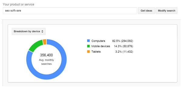
As you can see, mobile queries in this niche still account for only 14.3%. This is why these service providers didn’t optimize their websites for mobile users in the beginning of last year. But, with the rolling out of Mobilegeddon, most of them put the arm on and made the necessary changes to make their content mobile-friendly.
However, many still hold the opinion that if your mobile searches are less 15% of total queries, then there is no point investing your time and efforts in mobile SEO. But, with the increasing number of mobile queries and Google changing its algorithms to accommodate only the best results in the mobile SERPs, it’s difficult not to adapt to the trend and mold strategies around it.
Now the focus has shifted from “why to go mobile” to “how to go mobile”.
This is the year! If you haven’t optimized your website for mobile users yet, make it happen right now.
-
Mobile Indexing
Google already had the in-house technology to rank content for device specific queries (which it announced at Google Searchology 2009). But then, mobile and desktop ranks were determined using the same algorithm.
Then, came the Mobilegeddon shakeup and mobile-friendly content started getting better rankings on smartphone search results.
Google announced in March last year that they are creating a mobile index (Mobile sites would rank differently than desktop sites). But, we haven’t seen it yet.
I believe they are still working on it and would be launching it this year. If this happens, users will get the best platform-specific experience possible. I hope that the mobile update 2015 will soon evolve into a mobile-indexing update in 2016.
-
No App-Redirect Spam
With the advent of mobile indexing, app redirect spam in search results will be eliminated. It is very annoying to the users when they are asked to download an app every time they want to access the information.
Though Google announced the app interstitial demotions and the fact that it was dealing sternly with spammy mobile redirects, it still hasn’t achieved it completely.
As we head into 2016, I believe app redirect spam will be eliminated for real.
-
Responsive Design
Responsive web design is the “preferred” design for mobile configurations of websites by Google. A responsive web design helps in making your desktop content readable and navigable on a mobile automatically. No optimization necessary. This is becoming a trend, but it only works if it is done right.
You should understand that there is no clear evidence which points to that fact RWD gives you an added SEO value. This is why currently only 12% of websites are employing this method.
While it has its benefits, it might not be the right option for your site. If you want to optimize your website for smartphone users, there are other mobile configuration options that could help you improve both user experience and SEO.
With mobile indexing, webmasters might be better served by an option which allows them to show different content on their mobile and desktop websites.
[mks_separator style=”solid” height=”16″]
How can you prepare yourself for this?
[mks_separator style=”solid” height=”4″]

If your website is optimized for SEO, then most of the ground-work is already done.
-
Strike a balance between Mobile-Optimized and Mobile-Friendly Content
Once you are through with the design and site structure, choose the best way to host your website. Although there are a lot of options available, I would suggest you host your “mobile-only pages” at m.site.com subdomain or /m subfolder.
You don’t have to change the URLs of pages whose content will not change from desktop to mobile. Reformating them for mobile user agents will be perfectly acceptable in this case.
You can use redirects too, but the best option here would be to add canonical tags (it will help in passing the link juice to the desktop pages).
-
Redirect Properly
You should set appropriate redirects for “mobile-only” content. Present your desktop content to Googlebot and offer your “mobile” site to Googlebot Mobile and smartphone Googlebot.
In case you don’t have a tablet-optimized website, you can feature your desktop content to your tablet search users (they respond the best), but only after removing all the flash content.
-
Work on the Page Speed
Slow loading pages annoy mobile users more than desktop users. Optimizing images, minifying code, browser caching, reducing redirects are some of the alternatives that can help you reduce the loading time of your mobile web pages.
-
Go easy on CSS, Javascript and images
Earlier, mobile devices would not support the above-mentioned elements due to which webmasters had to block any or all of these. But with the advancement of technology, most smartphones now have features which can support CSS, Javascript and images. These elements are used by Smartphone Googlebot to determine if you have a responsive mobile website or not. Also, they would want to see the categorization of content. So, do not block any of these elements.
-
Avoid Using Flash
If users do not have the necessary plugins for this, it will be difficult and frustrating for them. Try HTML5 to give special effects.
-
Creating a Responsive web design
I know we talked about RWD as a solution which would not necessarily fit everyone’s needs but if it fits yours here are some of its main benefits:
- It automatically adjusts the site’s layout depending on the device it is being viewed on.
- The design deploys CSS3 media queries to offer the same content to desktop as well as smartphones using fluid grid and a flexible design.
- Responsive web design can help you reduce the bounce rate of your website, enhance the user experience, combat duplicate content, increase your mobile search rankings and domain authority.
-
Do not use pop-ups
Trying to close exit pop-ups on mobiles can be a real pain. Also, it might increase your bounce rate. So stop using all such pop ups !!
[mks_separator style=”solid” height=”16″]
Conclusion
[mks_separator style=”solid” height=”4″]
You cannot deny the importance mobiles, tablets and other handy devices hold in the current era of booming technology. Mobilegeddon was just the beginning to Google’s attempt of providing the best mobile user experience. With mobile searches surpassing desktop searches, Google will continue to tweak its algorithm internally to add the factors that would help mobile searchers.
Sure, there are some fixed mobile SEO best practices, but you need to go beyond them. You should constantly monitor your mobile site instead of just setting and forgetting it.
Given the frequency of changes happening in the SEO industry in the last 5 years, to be successful at mobile SEO, you should keep a constant check over web analytics to stay optimized.
Create mobile friendly content, redirect it appropriately, minify scripts, optimize images, focus on creating great mobile design.
Have you made your site mobile-friendly yet? Did you notice any changes in your mobile rankings after Mobilegeddon? I’d love to hear your thoughts and experiences!


18 Responses
I think Mobile Responsiveness and design plays a crucial role in improving the rankings.
Implemented majority of your tips and getting good result i am ranking on mobile version better than Desktop version :p Thanks for sharing Iftekhar bro
Thanks for Awesome Article , this article is very helpful .
Thanks for this guide. Surely going to implement!!!
Ok Good stuff,
but one confusion when we have more than 100K pages then how can we check all things, we have directory of textile and we are planing to upload more than 300K pages in next month. in this case how can check all pages for mobile friendly test ???
It is very beneficiary for a newbie blogger like I am. Keep posting these kinds of stuff. This seems to be very imformative.
Hi Sahil, Thanks for such as the amazing helpful guide. Mobile users are increasing day by day. That’s why peoples are also giving the importance on mobile SEO. Recently, I also started working with mobile SEO. Your guide about mobile SEO will help me a lot.
My Blog niche is about Android Mobile Upgrades. This will be a helpful tips for me as most of my visitors comes with mobiles.
Thanks for sharing this Informations.
I found the best guide on mobile SEO. I am running with a travel blog and researching on SEO good practices. Thanks for sharing the good news.
I’ve learn several good stuff here. Definitely price bookmarking for revisiting. I wonder how much attempt you set to make any such magnificent informative web site. Thanks for mobile seo guidance.
What a blog? I think this is the blog searching from last year. Thank you very much and this will be applied in my blog.
Real value seems in this post. Last year lot of websites got rank down after Google Mobile update. Now all the themes improve their structure and giving mobile friendly look to their templates. Mobile organic traffic is more than desktop. thanks for sharing the post.
Nice information for mobile SEO, however things are going to be more complex varying from platform like android, java, ios and more…noticed that Google rankings differ on different mobile platforms..more to learn as we are moving towards mobile internet very fast..
An awesome indept post with full of info.
Thanks for sharing
the article is long but not interesting .. and new content you simply round up the simple basic thing.
we excepting some advance thing. Anyways..
thanks
thanks for an amazing guide, will implement all these specially decreasing or reducing scripts.
Great post, Sahil!
Mobile SEO indeed is going to create a major trend in overall blogging arena. It’s time time to get shifted to mobile friendly blogs that can boost up the potential of bloggers further.
Thanks for sharing this!
Have a good day! Enjoy.
~ Rahul
Hi Sahil,
It’s an amazing post, these points are really necessary. But you would have mentioned about the Google AMP project also. But never mind it was a good post to read.
Thanks for the share.
Comments are closed.